

Every few weeks I send a dispatch from my studio desk to my paid subscribers. Today I’m sending this one to everyone because it’s summer!
Last month I had a very nice job come in for Vittles, an online food magazine that I really love. Moreover it was to illustrate a set of recipes by Rukmini Iyer, whose (very, very reliable) Roasting Tin cookbooks are owned and enjoyed by so many people I know, including me.


I’ve not done much food illustration before (and in the end the food wasn’t really the focus of this image) so I was especially delighted when Rukmini invited me over to her house to try the food I was going to be drawing. A proper treat! We sat in her very lovely garden (close to my old flat so I was happy to also get a wander in my old neighbourhood) which also served as the inspiration for the final image.
Next up I went to the studio and drew out a rough image. Rukmini wanted a children’s summer garden party which showed the food but didn’t focus on it (there’d be photos in the finished article). Instead the focus was on children having fun outside and the joys of an English garden in summer time.
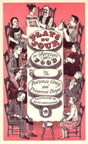
I had this classic cookbook cover illustration by David Gentleman in my head. Although now that I look at it the figures in this image don’t look very excited about their plats du jour! It’s still lovely though.
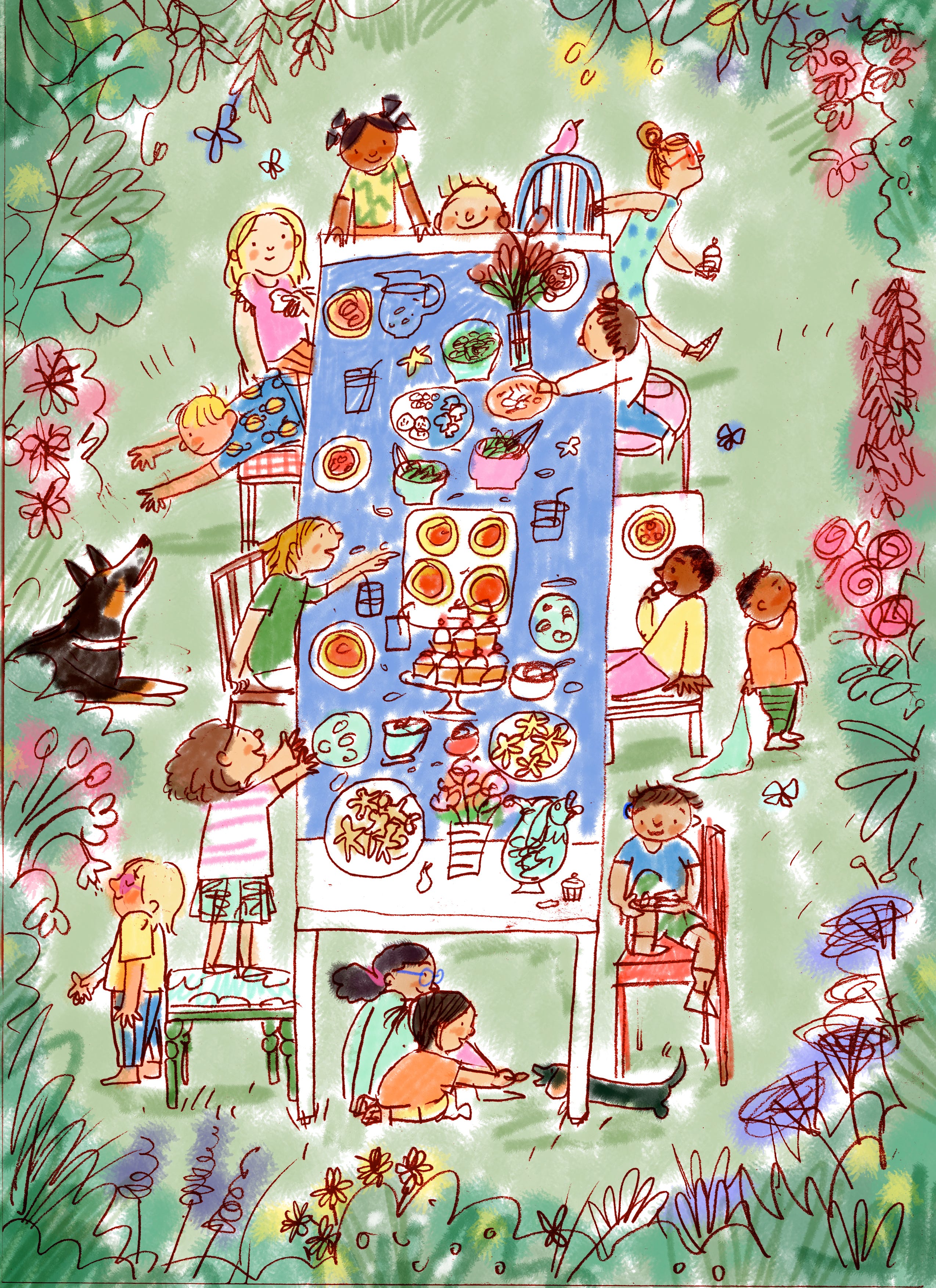
This was the sketch I sent to Rukmini and Rebecca at Vittles. I drew it by hand and coloured it digitally. I prefer drawing by hand. I’m aware it makes me sound like a luddite but I find it easier to find the shapes I want and the energy that makes things feel a bit alive when I work on paper. I did a few very scrappy layouts which I accidentally threw away before I realised they’d be useful for this post and then I did this full page image.
The sketch was approved and I started the painting. I always forget to photograph each stage so here are the two I remembered to take!


You can see that there’s only a very pale wash in the background and in the final image (below) the background is more green. I was tempted to leave just the wash as I liked the clarity and freshness but, as it was supposed to be an idyllic garden, the pale yellow seemed to suggest frazzled, dried up grass and not a fresh, green lawn. So I altered it in photoshop to make it a bit more summery! Here’s the finished image.
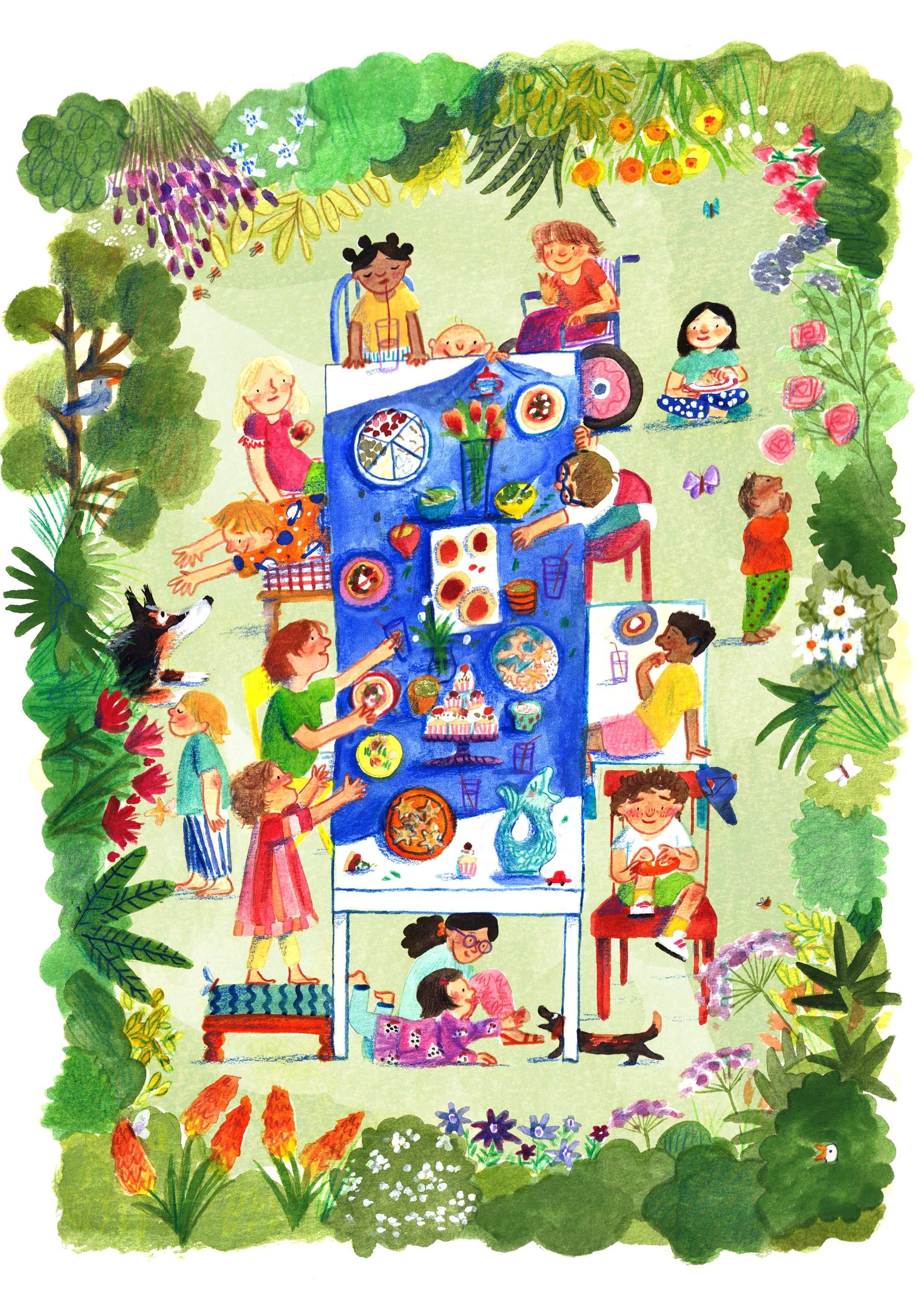
Above you can see Rukmini’s two daughters (on the stool in pink and under the table in purple) as well as my nephew smelling the flowers. When drawing lots of characters I love to include some real life people.
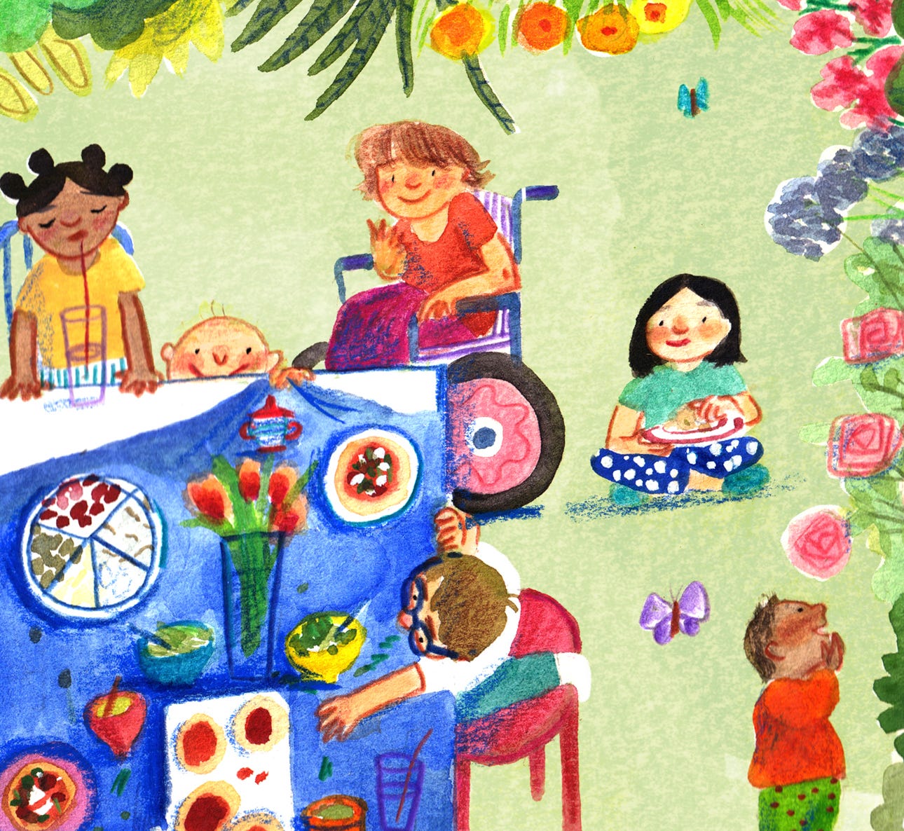
Also particularly fond of this baby who is about to cause chaos by pulling the tablecloth!
You can read all the recipes and see the image in situ if you subscribe to Vittles.
You can also pre-order a giclee print of this image here . All the profits (which basically means once I’ve paid the printing costs) will go to the Sameer Project who are raising money to directly help families in Gaza.
As well as telling you what I’ve been up to (whether you like it or not) I also try to include a picture book that I’ve been looking at.
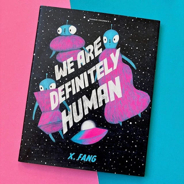
I picked up ‘We are definitely human by X. Fang’ when I went to visit Kerry in Scotland in May. I love Dim Sum Palace, Fang’s previous book and this one is equally playfully written and delicious to look at. (I’ve had to borrow photos from Shelf Editions because mine won’t download. Buy your books from Shelf Editions!)
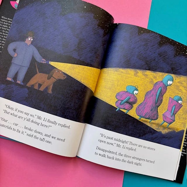
Mr and Mrs Li wake up to find aliens (or…are they humans?) have landed in their garden. They offer them a place to stay for the night and the aliens set about trying to convince the Lis that they’re human.
A very quick way to my heart is having a character from one world try and fit in in another. It’s a simple joke, it’s been done hundreds of times and yet. It always tickles me.
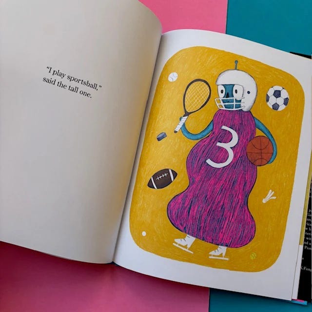
Rarely have I related to a character so much. Being both very tall and excellent at sportsball.
I love how sculptural Fang’s drawings are. Such big bold shapes that seem to possess real weight. This time the slightly muted palette of Dim Sum Palace is repeated with the addition of these really bright alien colours which are so zingy and fun against the countryside browns and yellows of Mr & Mrs Li’s home.
‘We are definitely human’ is a great example of a nice clear plot done very well. It’s funny and sweet and doesn’t labour the point (that humans offer help to those in need) but doesn’t bury it either. I’m sort of resisting sharing my favourite spreads here cos I think it’s such a delightful book that you should go and find your own. Also, my bloody photos won’t download. I’m keen to see what X. Fang does next!
A reminder that I’ll be at the Edinburgh book festival on August 20th doing a graphic novel workshop!
And in ROME in November running a five day picture book retreat with Inky Larks.
That’s all I’ve got right now. I’d better do some actual work!
Lizzy
Love this Lizzy! And love Rumini’s recipe’s too. What a perfect pairing, like wine and cheese!! Love seeing your process too. I’m an analogue gal too. I just prefer my drawings with a pencil. The iPad, no matter what the pencil or app, doesn’t touch it! X
Delightful!