


Last week saw the UK publication of a book I illustrated in 2022/23 for Puffin. One Last Thing is written by the extra-brilliant Natalia O’Hara and tells the story of Mattie, a funny, mad and very persistent little girl who has just one last thing to say before she goes to sleep. I imagine it’s not a totally unfamiliar situation to most parents.
I thought I’d take you through the stages of working on that book, mainly useing the first double spread as reference. I can’t tell if this is going to be a bit dry…sorry in advance.
SO. Part 1 is the thumbnails. I really like a thumbnail, far more than the actual rough sketches if I’m honest. When I’m writing and illustrating a picture book the thumbnails feels a bit more like an extension of the writing process. It’s where you learn what the images do for your text. It can help you work out knots in your storytelling and spot errors in pacing and balance. I think the thumbnail is madly under-rated and certainly bang on about them to my students in a way that they almost certainly mock behind my back. Yet even I, a big thumbnail fan, don’t exploit them to their fullest. I should try to remember to do BIG thumbnails more often. I think drawing BIG but very, very reductively and loosely can be so exciting. When you draw big and rough you draw with your arm and not your hand, that movement and motion shows in the drawings. If your page layouts are lacking movement then doing a large-format thumbnail might give you the energy you need. You can light-box the drawing to do a more detailed rough over the top and still retain that urgent energy of the scrappy sketch. So here are my thumbnails for the first spread.

There was actually a thumbnail before these drawings but I can’t find it. I think it only existed on a scrap of paper. So these four images have the same ingredients but i’m playing with the scale, ang
le and perspective to see what my options are. In the first image (in which i’ve accidentally place Dad over the gutter, a very basic mistake), I have all the elements, front-on. We can see Mattie and Dad, plus the bed, plus the toys and games she’s discarded during the very protracted process of going to bed. The whole story is there. In number two we’re a bit closer, so we lose most of the mess she’s made and, as a result, we lose a bit of story-telling. In number three we’ve pulled right back, we see the full force of the chaos BUT we don’t see our characters very closely. I think it’s important to establish your characters, visually, on page one. I think you should be able to see, for want of a better phrase, the whites of their eyes. Finally in image four we see our characters up close, we’re IN the story with them, but we’ve lost most of the bedroom.
So, in the end, although it was the composition that felt the most basic to me, number one (with Dad out of the gutter) was the one that served the story the best.


After the thumbnails I get stuck in with character designs. I filled most of a sketchbook for this stage of this book. Here you work out important details about the character and their physicality but also some stuff about you. What can YOU draw over and over, what materials do you feel confident and secure with? How will those materials work when applied to backgrounds and objects as well as people? I loved some of the looser sketches I did of Mattie but I knew I couldn’t reliably replicate on a chair or a hallway. I didn’t feel fluent in that visual language. Not yet.
(As an aside I think it’s hard to accept, sometimes, the limitations of your own hand and eye. They do what they do. I certainly lose patience with myself when I notice I’m doing the same thing over and over. And yet. To someone else your repetitious habits will be magical, the way you draw hair? Inspired! You don’t have to love your own work every time…just the process of making it)

I do thumbnails on paper for myself and then I send a more legible black and white set of drawings to the art director (in this instance, Keren Greenfeld). These black and white drawings are clear but loose. Sometimes I do them on paper but here I did them in procreate for speed. The goal is to be able to show the art director what I’m thinking for the story. Here are the facts, the detail comes later.
The text for this book is richly imaginative and playful, involving made-up words and flights of fancy so I wanted to tether the pictures to reality for balance and to ensure the reader would understand what was happening even when we’d gone into Mattie’s imaginary world.
The drawing itself is loose and functional. I add a grey tone layer to help with clarity. Sometimes on a basic b&w drawing the heirachy of information (where we want the eye to travel first, second, third) is lost. I find the grey gives it a bit more weight and depth. Here, I’ll show you another double spread to explain what I mean.

Without the grey we wouldn’t know where the darkness was, or the light. We need the grey.

Next is a colour rough I drew my images by hand at the right scale. There is a difference between how I draw on procreate and how i draw on paper (I prefer the paper but sometimes convenience wins out). I had to draw these roughs by hand to show, more accurately, what the book would actually look like.
Here is a confession. I hate roughs. Love thumbnails, hate roughs. I know that I have a limited reserve of enthusiasm for an image. The more times I draw it the more the enthusiatic energy dwindles. It’s disappointing but true. I long to be one of those people who can paint a scene five times and choose a favourite but alas, I can do it twice, max, before my magpie-brain wants to move on to other lovely things.
So I don’t paint my roughs. I colour them digitally. Partly this is because, in publishing, there’s never as much time as you’d like and I want to devote as much of that time as possible to final paintings. But also! A digital palette helps me plan the colours in a more orderly and considered way. I can try out options and see what works. I knew I wanted to limit the palette in this book. It’s colourful but it’s the same set of colours, all the instances of yellow are the same yellow, all the blue is the same blue and so on and so forth. A limited palette makes the book coherent. Obviously when we think of a limited palette we think of two or three or four colours but twelve or twenty is still a reduction on the entire spectrum of the human eye! And using a computer for the colour here helps me plan for this.

And then we paint! I’ve not got the stages of this image photographed but here’s the full edited image with no text. The blue ended up having to be digital as I didn’t trust myself to pull off an even wash whilst keeping everything clear and neat. I based Mattie’s Dad’s face on a particular photo of my friend Matt which always makes me laugh.
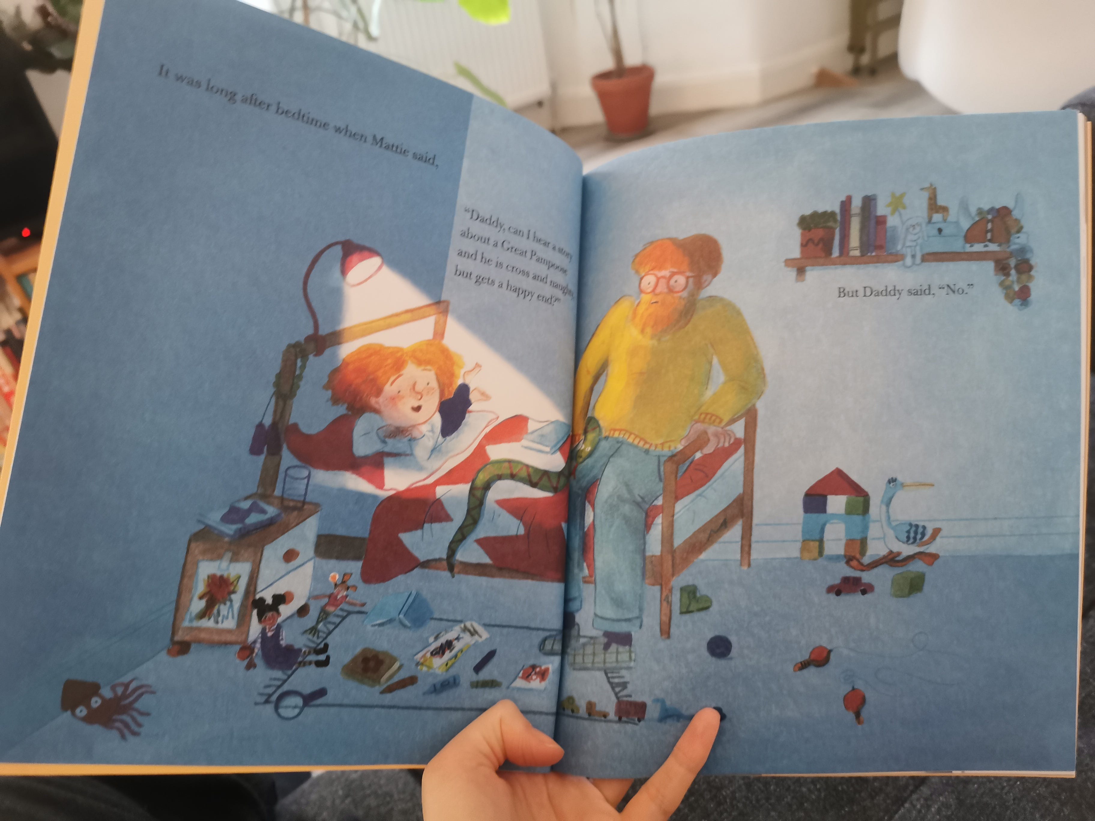
And here it is in the book!


So there we go! One Last Thing is available from booksellers now. Here’s a link to the bookshop.org page which, annoyingly, doesn’t have the cover image working. Please pick up a copy if you fancy it! There’s so little PR for non-debut picture books, so we’re having to do our own, so if you like it, please tell someone. Natalia and I would be so grateful!
Loved this, thank you for sharing!
Thank you for sharing this 'for free'! What a lovely insight into your process!