
Fake Art
On making and consuming fictional artworks

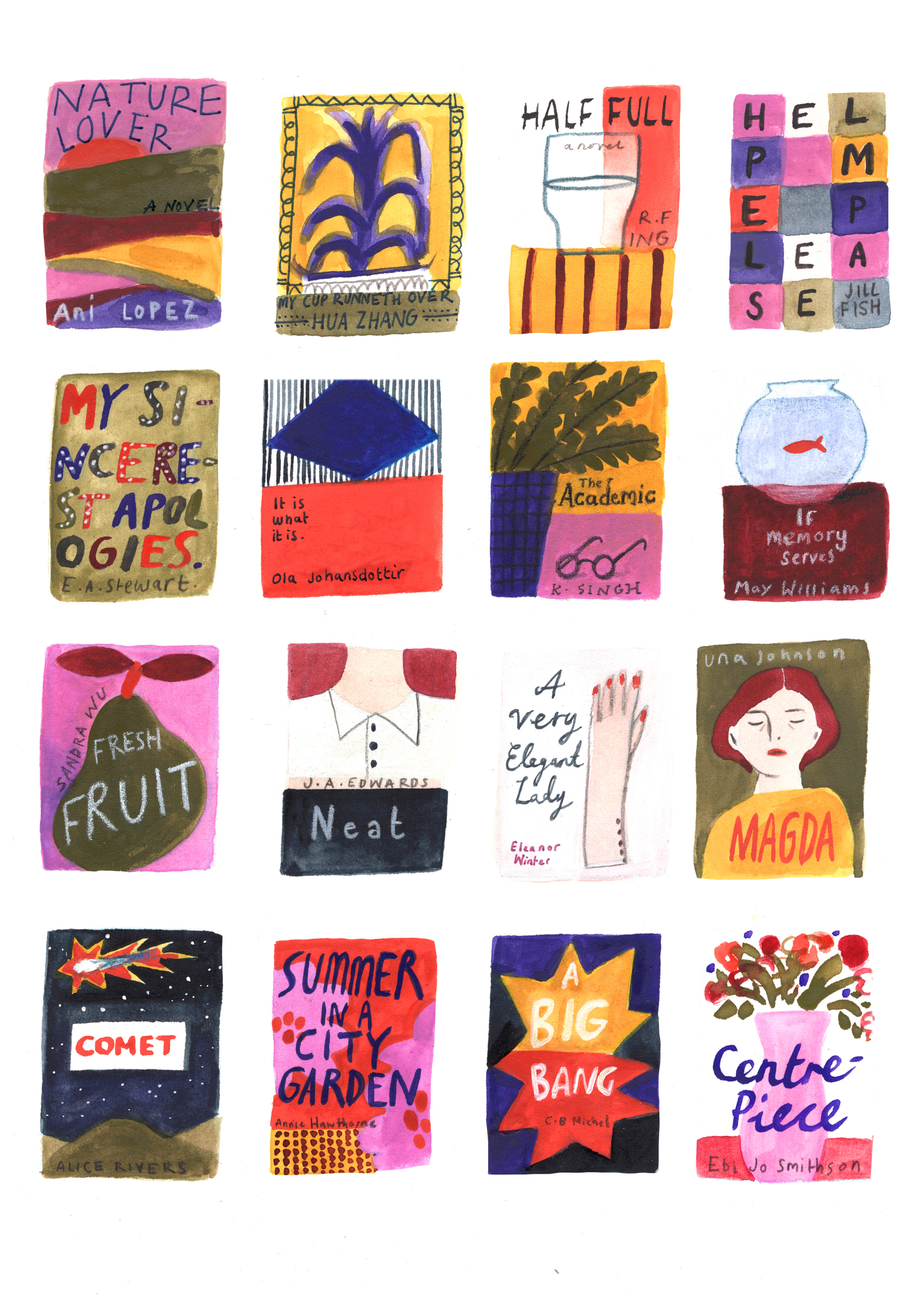
I painted this last month. None of these books exist (a print of this image does, though).
One of the things I find is most likely to pull me out of a story (a novel/film/ TV show) is implausible art. I suspect this has something to do with my job. Much as surgeon might cringe watching a daytime medical drama, or a journalist complain that that hard-nosed fictional reporter had done literally no fact checking, I find visual art in narrative art is a complete minefield.
I suspect part of the problem is the desire, as a writer, to make your character the absolute best in the business. It means that the audience has to believe that the art the character makes is plausibly brilliant when more than likely, the author is not a celebrated painter or sculptor as well as being a great writer. So one of two things happens. The first is that the author makes up some art and it sounds very, very bad. I can’t cope with descriptions of ‘paint swirling across the canvas’ or ‘colours that dance’. No thanks. The seconf option is to co-opt existing work. So then you recognise the work of a real artist being described as the work of this, fictional, character. It’s a personal grudge but both things irk me.
All this to say that I really shot myself in the foot when I wrote a book about not one but three (actually, technically, four if you include Roger) painters….
Alison
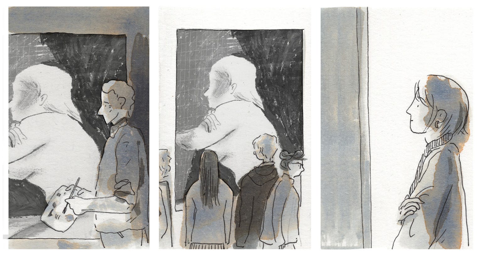
In the early stages of imagining this book I assumed I’d make a whole body of work for Alison. As I got through the early drafts though I realised how distracting this would be and, actually, how inconsiquential it was to her story. The work itself wasn’t the focus, her relationship to it was.
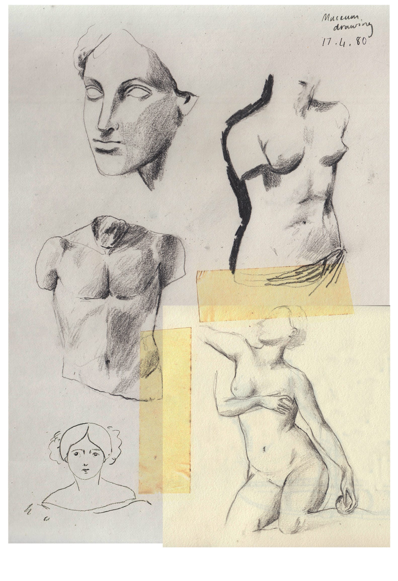
In the end I included some pages from my own, old, sketchbooks (above). More than anything I remember how making things look ‘good’ defined the early stages of my own drawing and painting so it made sense that Alison would start out here too.
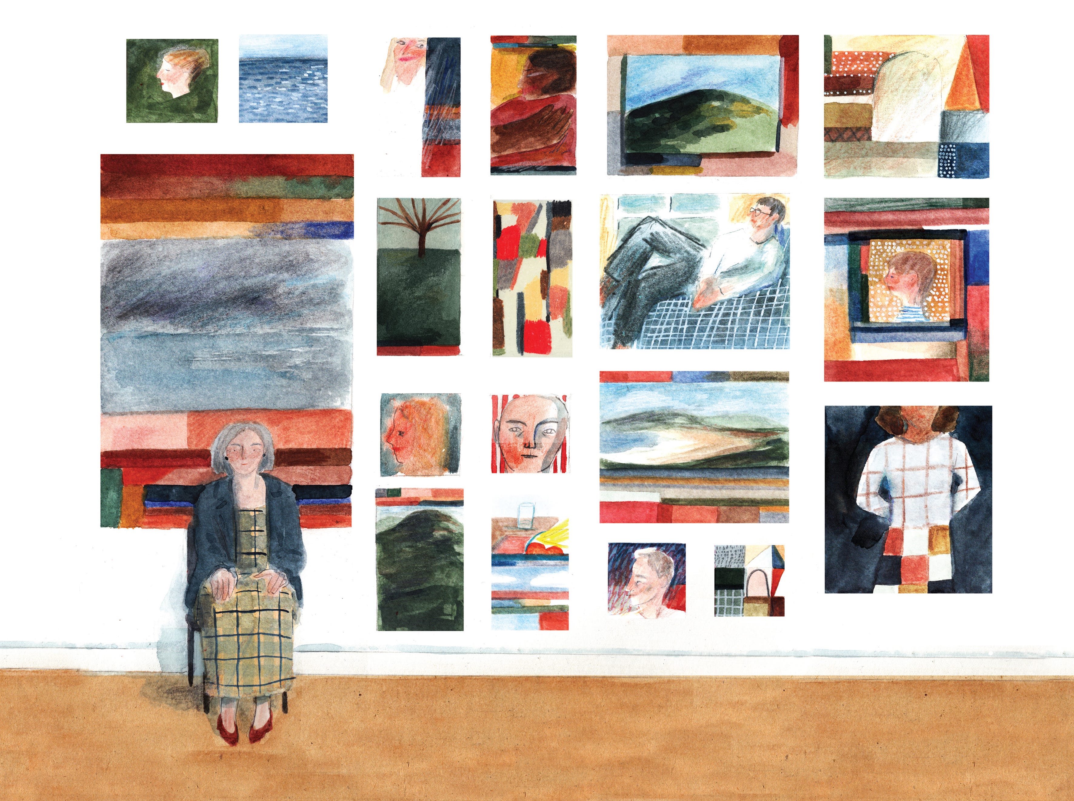
The only clear examples of her work come at the very end (spoiler!). This page includes painting of Tessa and Roger as well as Patrick and Ivan alongside landscapes and abstract forms. I knew Alison’s work would be colourful and exuberant, maybe a bit erratic. I decided to present everything from a distance, a bit fuzzy, so the reader doesn’t really have to worry about whether they’re ‘good’ or not. The whole image is illustrative of a mood rather than descriptive of detail. I think!
Tessa
My next, very clever, move was to make Tessa a sculptor. This was especially genius considering a) books are two dimensional and b) I have been consistently terrible at working three-dimensionally my entire life. So not only did I have to invent sculptural work (that sat with the kind being produced by artists in the 80s and 90s) but then I had to present them in flat drawing. Spectacular planning!
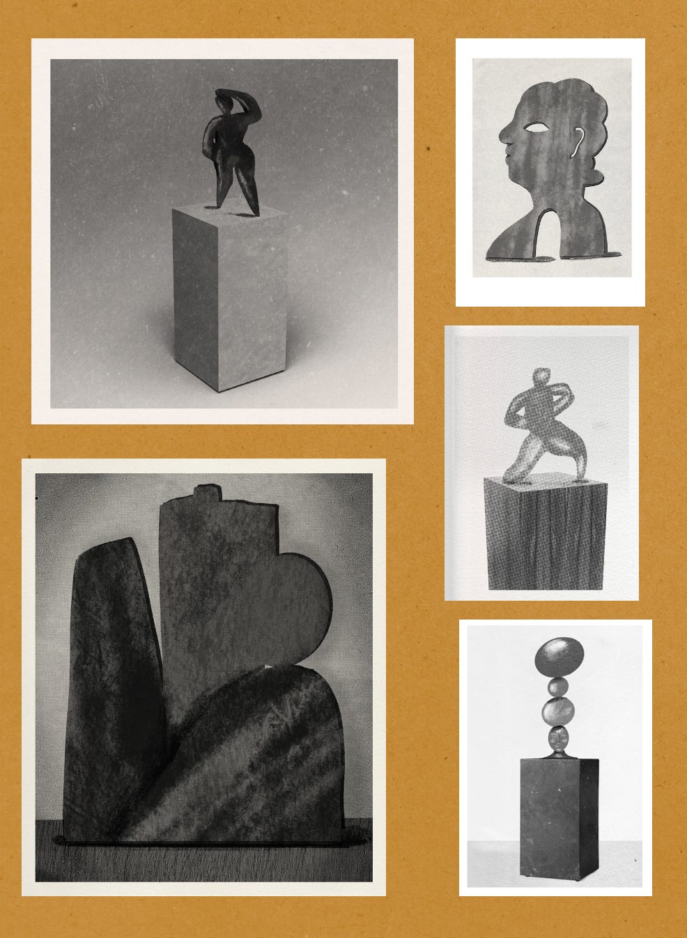
Much like Alison’s paintings, Tessa sculptures only appear once, properly. I decided to present them as catalogue photos, the half-tone kind that appear in gallery descriptions and art history books printed before digital colour printing got cheaper (and then more expensive again). Because Tess is the coolest character I decided that she worked in metal, because that’s pretty cool isn’t it? I thought a lot of Barbara Hepworth (obviously) and Elizabeth Frink. I imagined large planes of rusted metal, maybe copper and iron, where the colours go all rich and delicious and organic looking. And then I presented them in black and white! Anyway. I thought this was the hardest thing I”d have to do but actually…
Patrick
If you write about an artist who’s meant to be the greatest of his generation and your book contains images (that you create!) then you’ve really made a terrible set of decisions. Speaking from experience
I didn’t want to make Patrick a (very) pale imitation of Freud or Bacon or Hockney or any of the other big hitters of the latter half of the twentieth century. But the alternative was to invent a BRAND NEW and believably impressive set of paintings. Which wasn’t really within my capabilities. So instead I scrapped all the panels I’d planned would include Patrick Kerr’s work. You get a couple of glimpses on exhibition flyers and posters and just one visible painting halfway through the book (repeated towards the end). The thought of Patrick’s work still makes me nervous, which I suppose suggests I didn’t fully solve the problem! However the problem was very, very difficult so please be kind to me!
Imaginary Art - Some work I like within works that I like.
In the Reign of Harad IV by Steven Millhauser read by Cynthia Ozick for the New Yorker Fiction Podcast. This episode came out over ten years ago and this story still comes back to me now and again (and only partially because of Ozick’s very precise pronounciation of ‘miniature’).
Miniatures are a recurring choice, in fact. Catherine Keener makes tiny paintings in Synecdoche, New York (which I’ve seen once and have sworn not to watch again). Laurie Simmons photographs mini scenes in Lena Dunham’s Tiny Furniture. As well as being believable, the absurdity of tiny work also works as a metaphor for the creative process, and the art world as a whole, as being sort of ridiculous from the outside.
There’s a description of an artwork on film that doesn’t exist in Susanna Clarke’s Piranesi that I found utterly believable and vivid. This was possibly heightened by the fact I was listening to the story as an audiobook. Chiwitel Ejiofor is the perfect narrator.
I’ve not read it for a very long time but I remember being fully on board with the works described by Siri Hustvedt in What I Loved. They seemed utterly believable as part of the New York Art Scene in the late 80s and early 90s. Although I can only dimly remember the plot I can definitely remember being relieved that I wasn’t cringing through the description of (the fictional) Bill Weschler’s painting.
There’s definitely loads more but it’s a friday afternoon and lists are hard. So I’ll give you the songs in Christopher Guest’s, incredibly fun, A Mighty Wind.
What’s your favourite imaginary art work from pop culture?
(a caveat to all this is that I am not genuinely angry when people write bad art. It’s fine! I’m at peace with it. I know it’s always better to try and fail than not try at all!)
Hi Lizzy, great post! I thought you dealt brilliantly with the depictions not only of art, but artists in Alison! I grew up (kind of) in that world, as my dad is a painter and my mum is a sculptor (they met at art college!) and it felt really evocative of my childhood. I remember having some feeling that could have been close to cringe reading What I Loved, I think she does quite a lot of describing of paintings (in my memory, although I could have embellished that!).
Originally I thought you were going to talk about paintings in the backgrounds of film and TV, which I always find super distracting! I am always commenting about them: “those paintings are disgusting!” Etc...!
Ha Lizzy, I laughed at the bit where you swore to never watch Synecdoche, NY again. My brain's gone blank for fictional artwork - my first thought was a sculpture described in a short story I'd listened to on a podcast, but I googled it and it turned out to be a real sculpture (it was Félix González-Torres's Portrait of Ross and I can't remember the name of the short story that mentioned it now, either. Useless.)