I struggle with reality. At the very least this is true in terms of drawing, increasingly this may also be accurate in relation to world events however this isn’t what I’m writing to you about.
I write stories that are anchored in ordinary reality. There’s nothing fantastical happening in a Lizzy Stewart story. I’m just not that inventive. So the first thing I have to wrestle with is how I make the world look like the world. I find this tricky. I will readily admit that I’m pretty sloppy and I don’t excel at straight lines. When I do use a ruler that ruler has at least three wobbles cut into it by my over-zealous craft knifing. So even when I’m trying to be neat I’m woefully wobbly (also the name of my auto-biography).
I have to pick and choose what I include in the background of my images. What are the things that will describe the feel of the place without forcing me (sloppy) to have to draw in fiddly, accurate detail. Often it’s simply a case of remembering what makes a room feel lived in. There’s always a glass of water on the side and papers pile up on tables regardless of how efficiently neat we might be. Most homes have, at least, one or two plants, and walls with no pictures on are a little bleak (to me).
I map the layouts of the buildings I’m drawing. In the book I’m working on this has meant employing Owen to help me draw a full floorplan based on a building I already know which I’m adapting to suit the story better. For me, using places I’m familiar with takes out the panic of having to remember what might appear in the background behind a character. If I can accurately walk through the space in my head then I’ll always know what is in sight wherever I position my fictional characters. Hopefully.
So in a very straightforward way I’m assessing reality. Picking and choosing, editing the physical world to my own ends. Hopefully the result is something that feels like real life even I’ve not represented absolutely everything.
Reality troubles me in another way, though; and that is how much reality, or realism, I bring to my characters faces and bodies.
‘Where do you sit on the spectrum of reality’ is a (not very well phrased) note in my sketchbook. I’ve been drawing my characters over and over again. I have a massive folder of photo reference (mostly actors that I think might resemble the person I’m imagining. Perhaps one day I can share my Alison fantasy casting). I have to develop a system for drawing them over and over. Personally, I’m OK with the line of a face wavering a little across the stretch of a book. The line of my real-life face wavers plenty! I’d much rather see the flaws of the hand drawing the face than overly polished and corrected consistency. But I have to establish who they are, physically, as solidly as possible before I start drawing the panels.
Which leads me to think about taste. Primarily my own, but also I suppose I’m second guessing yours at the same time. What do I like? What do you like?
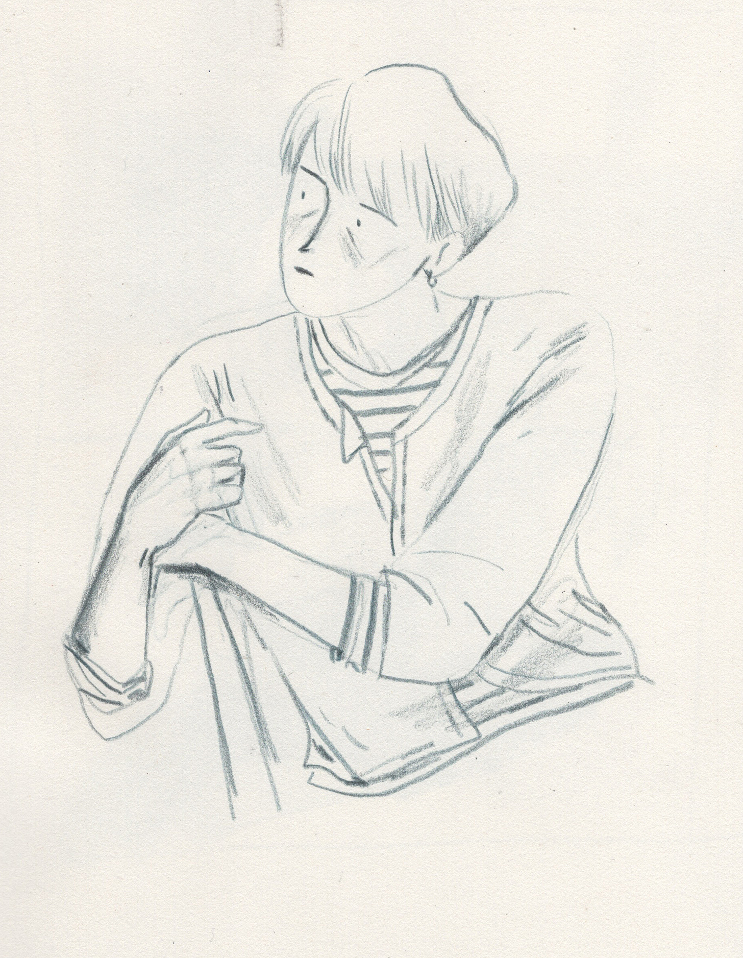
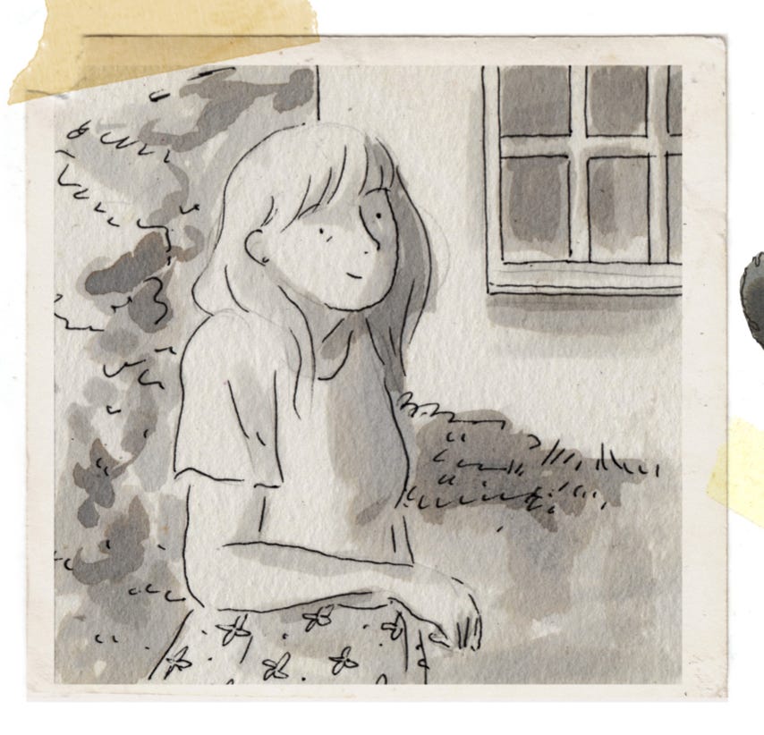
I’m not fussed about photo-real or even broadly realistic faces. I draw dots for eyes and lines for mouths and, for me, that gives enough suggestion of a person to work with. I could add more detail to the drawing above but what else would it tell you? We already know how she’s sat, her expression and what she’s wearing.
When I was drawing Alison I had myself in mind, mostly. What would I, as a reader, tolerate or maybe even enjoy looking at?
I also tried to think about the taste of a fictional reader, My reader read novels, they went to art galleries, they, most likely, identified as female, they probably had strong feelings about winter coats and walking around Bloomsbury. My fictional reader also had their own taste. They knew what they liked. And whilst I absolutely cannot please every iteration of the fictional reader, it’s important to think of what they might relate to on the page.
I assumed that my reader hadn’t read many graphic novels, perhaps this might even be the first one they’d read. What would make them comfortable? What would make them feel aesthetically at ease? Was it realism? Would something overly stylish be legible to someone who, unlike a lot of my friends, didn’t spend every waking hour of the day trying to create or decipher images?
This all sounds clinical but obviously all of this actually took place in split seconds, unconsciously. I’m laying it out here in the hope of explaining the process when the process itself isn’t really visible. It’s a series of gut decisions based on, I hope, good instincts.
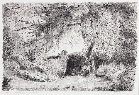
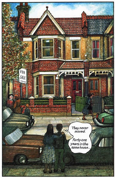
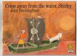
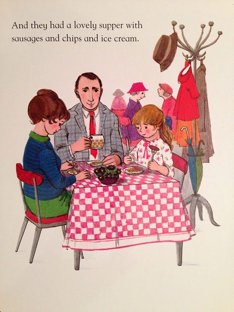
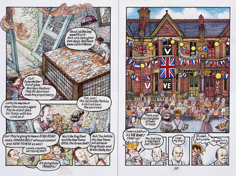
Children’s books were my biggest touchstone, specifically the ones I grew up with; Raymond Briggs, John Burningham, Helen Oxenbury and Judith Kerr, whose books were colourful and textural and often deeply ordinary in theme. It’s a world I know. I’ve illustrated a handful of picture books and I teach on a picture book course. I know the way that people feel when they, as an adult, revisit a book they loved as a child, the way that those illustrations can make you feel. For me the fact that most people had a relationship with illustrated books as a child was the key to writing an illustrated book for adults.
So, I think, what I ended up with was much closer to Raymond Briggs and Judith Kerr than the assumptions a new-reader might make about graphic novel visuals. I’m not trying to say that I was being clever or subversive or especially inventive. I’m not that pleased with myself. But it was the right decision for the story, I think. I hope the book feels accessible and approachable and I hope, sincerely, that although the images are functional storytelling tools there are also at least a few that people find pleasing as images on their own.
Back to realism.
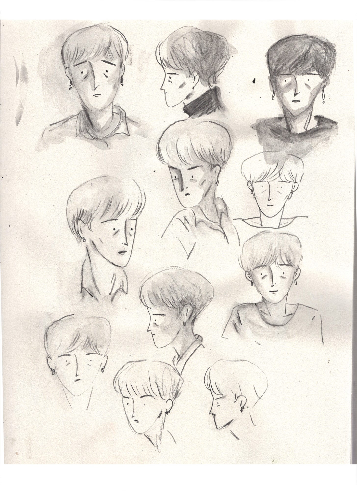
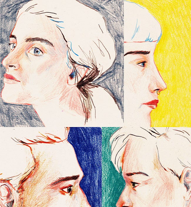
I couldn’t draw a whole book like this.
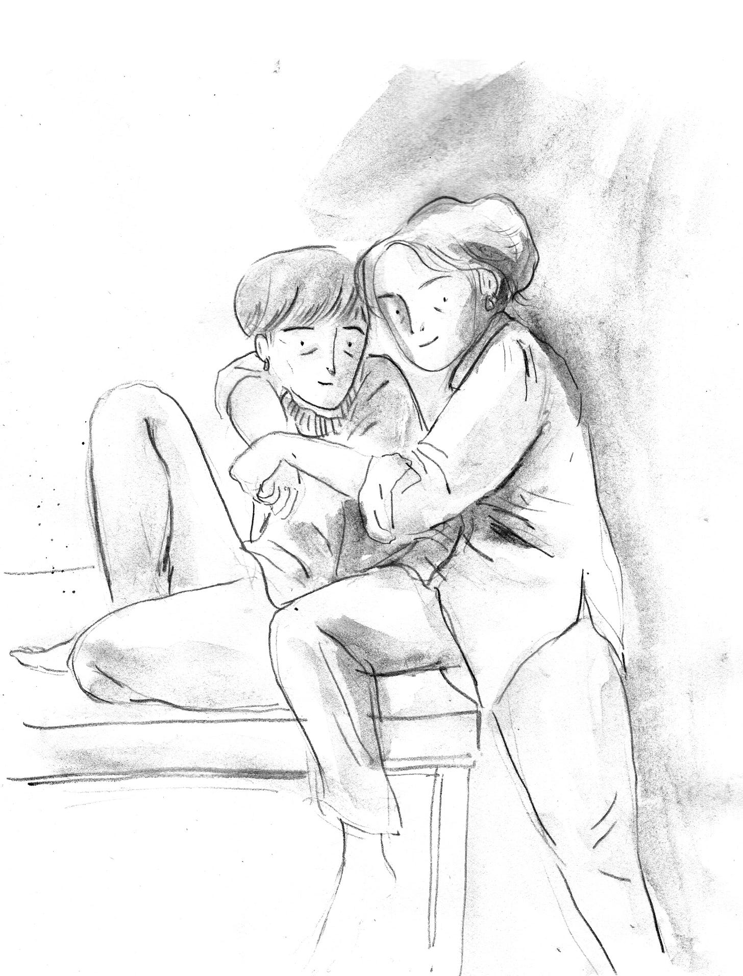
Nor even like this. Which is looser and more energetic.
This level of realism requires so much concentration from me, a sloppy artist, that it stiffens everything up and makes it too rigid.
Better to break a face into a few quick lines and retain some life and energy.
The facts of a person can be communicated in much more interesting ways than a photo-real nose. What do they wear? How do they move? How is their hair cut or styled? How do they hold their bodies? Where do they place themselves? If I can tell you this, even loosely, then we’re getting somewhere.
I’m still figuring out how this new book is going to look. Some of the images I’ve shared today are from my sketchbooks for that project. Some of them may even end up in the book! There’s a post about how I’ve been ‘exploring materials’ from earlier in January available to my paid subcribers, if you want to know more. Thanks for reading and, as ever, tell me if there’s something you want to know more about.
All the best,
Lizzy
Reading: Yesterday I finished Ordinary Human Failings by Megan Nolan, which was great. Now- The Manningtree Witches by A.K. Blakemore.
Watching: We just finished s3 of Slow Horses and now I miss my useless gaggle of spies.
Listening to: I’m a sucker for some baroque pop and The Last Dinner Party are certainly scratching that itch at the moment.





You are 100% correct on your imagined readers' key attributes! (Tightens wool coat for a mooch around town, novel in hand)
Lizzy, thank you for sharing such a thoughtful and insightful post on your creative process. You’ve given me much to think about. Will Alison be published in the US? I do hope so!